We've seen color rush uniforms work to varying levels of success in the NFL.
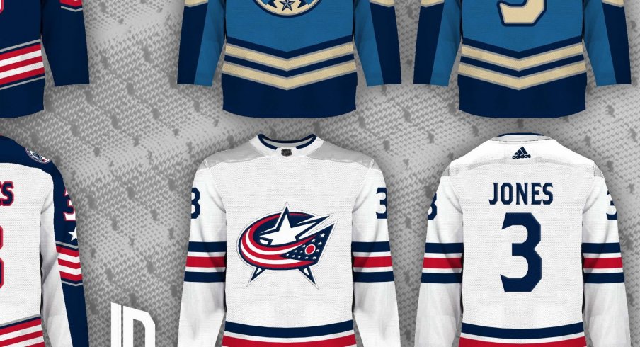
Now, thanks to a concept from Lucas Daitchman on Twitter, we can see what such an idea might look like if the NHL adopted it.
My #CBJ third jersey concept was well received, so their primary jerseys in my new concept series are based off of it. The light blue version stays on as the third jersey, and it's joined by a colour rush fourth jersey. pic.twitter.com/KS4IBI5lTN
— Lucas Daitchman (@ldconcepts) May 11, 2020
The bottom right jersey is an absolute pièce de résistance, and I would love to see the Blue Jackets wearing them someday.
Daitchman told 1st Ohio Battery that "this design is the first in a new series, where I'm giving every NHL team which (in my opinion) needs new jerseys, a set of four new jerseys. The home, road and third jerseys feature chevrons based off of Civil War uniforms, though the difference lives in the coloring."
The chevrons are a nice touch and are certainly unique to the designs that Blue Jackets fans have experienced in the past.
He continued: "The main jerseys' striping is inspired by the Ohio flag in the logo, while the third jersey takes their current third jersey's color scheme and turns it a bit on its head. All the other jerseys are very blue heavy, so the fourth color rush-esque jersey takes a bit of a break from that. It gets rid of all silver and number outlines, and I picture it with white gloves like Buffalo's 50th-anniversary jersey."
The "color rush-esque" jersey, as Daitchman describes it, certainly is a refreshing take on a Blue Jackets' jersey. With white gloves, it would certainly have a crisp, clean feel that the current white jerseys are lacking.
"I feel like the (Blue Jackets) primary logo is the strongest element in their brand: it strikes a nice visual balance between both the "Columbus" and "Blue Jackets" parts of their name," said Daitchman. "However, I think their jerseys are among the worst in the league. They're way too plain for my taste, they have no character, they add nothing to the brand. That's why I added the chevrons, silver and Ohio flag striping in my concept. The plain jerseys are the reason I think most fans prefer their third jerseys, and while I like them as third jerseys, I feel like the roundel logo isn't strong enough to carry the entire brand."
So, what are your thoughts, Blue Jackets fans? Are you content with the Blue Jackets' current jerseys, or are you ready for them to switch it up?


