Let's be honest: hockey players always look better.
The NFL rolled out their "color rush" jersey line in 2012, with the hope of having games with each team in a uniform that is primarily one solid color with alternating colored accents.
The criticism was all over the board, and has led to some teams not even adopting the jerseys in games. Typically, though, almost every team wears a color rush uniform set once during the regular season.
So, if the NHL were to adopt a color rush jersey line for its teams, what would they look like, and whose would be the best? Thanks to several contributors at Behance.Net, we don't have to wonder.
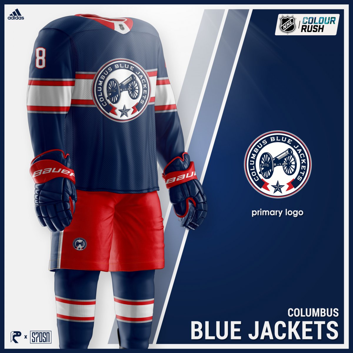
Here is a mock-up of Blue Jackets defenseman Seth Jones sporting a potential color rush jersey design, and below that is the full uniform set.


Yes, the jersey features the polarizing alternate cannon logo that exists on the club's current third jerseys, but overall, the jersey flows incredibly well.
Since their inception, the Blue Jackets have strayed away from having any sort of stripe or huge design across the torso of their jersey, except for the main logo.
The colors in general aren't incredibly different. The white is a little more off-white, and the blue is a little lighter version of navy. A bigger change is the stripe across the chest which seems like the addition that the cannon logo always needed.
The rest of the NHL's jersey designs can be found on the Behance site. Sadly, the Rangers may have the best.
What are your thoughts on these mock-up jerseys? Let us know in the comments.

